Tracking Your Reader's Journey
I recently came across a progress bar at the top of a blog page on Alexandru's website (kudos to him—it looks great). I thought this was incredibly helpful and wanted to implement the same feature on my own site, specifically using Jaspr. From a Flutter perspective, this seemed like a straightforward widget to create, but how would that translate to another Dart framework?
Implementing the Progress Bar
First things first, I needed to apply the proper CSS to my site. I imported the Bulma CSS
within the head of the Document (located in main.server.dart). Bulma had a very sleek
Progress Bar component that made it perfect for this use case.
runApp(
  Document(
    head: [
      const link(rel: 'manifest', href: 'manifest.json'),
      link(rel: 'stylesheet', href: bulmaCSS),
    ],
  ),
);
Next, I set up the ScrollProgressBar as a StatefulComponent, as its state needed to be updated as I scrolled the page. I made sure to add the
@client annotation here as well, because I wanted this component to be
interactive rather than static. Finally, I provided two properties for the
ScrollProgressBarState: scrollProgress and
scrollListener.
import 'package:jaspr/dom.dart';
import 'package:jaspr/jaspr.dart';
import 'package:universal_web/web.dart' as web;
import 'package:universal_web/js_interop.dart';

/// Fixed progress bar that displays scroll progress at the top
class ScrollProgressBar extends StatefulComponent {
  const ScrollProgressBar({super.key});

  @override
  State<ScrollProgressBar> createState() => ScrollProgressBarState();
}

class ScrollProgressBarState extends State<ScrollProgressBar> {
  /// Current scroll progress as a decimal (0.0-1.0)
  double scrollProgress = 0;

  /// Scroll event listener
  web.EventListener? _scrollListener;
}
Within the initState method, I first checked if I was currently on the web (the client) to determine whether I needed to create the
scrollListener. This component wasn't necessary on the server side and could have caused potential errors if a render was attempted there. If I was on the web, I created the
scrollListener and added it as a listener for the current view.
@override
  void initState() {
    super.initState();

    // Create the event listener
    if (kIsWeb) {
      _scrollListener = (web.Event event) {
        _updateScrollProgress();
      }.toJS;

      // Add scroll listener after component mounts
      web.window.addEventListener('scroll', _scrollListener);
    }
  }
I also needed to dispose of the listener properly. If the event listener remained active throughout the site, it could have caused problems such as memory leaks, multiple listener accumulation, and runtime errors.
  @override
  void dispose() {
    // Clean up the listener when component is removed
    if (_scrollListener != null) {
      web.window.removeEventListener('scroll', _scrollListener);
    }
    super.dispose();
  }
Now it was time for the meat and potatoes. The _updateScrollProgress method was responsible for determining the
scrollProgress, which I used to show how complete the progress bar was. The process I followed was:
- Get
scrollTop- current scroll position in the document. - Calculate
docHeight- total height of the document. - Calculate
windowHeight- height of the visible viewport. - Calculate
scrollableHeight- total height minus the viewport. -
Calculate
progress- current scroll position divided by the total scrollable height.
I also added a clamp check from 0 to 1, which ensured I always had a value between those two numbers.
  /// Calculates and updates the scroll progress percentage.
  void _updateScrollProgress() {
    // Current vertical scroll position from the top of the document
    final scrollTop = web.window.scrollY;

    // Total height of the document including non-visible content
    final docHeight = web.document.documentElement?.scrollHeight ?? 0;

    // Height of the visible viewport
    final windowHeight = web.window.innerHeight;

    // Calculate the scrollable distance (total height minus viewport)
    final scrollableHeight = docHeight - windowHeight;

    // Calculate progress as a decimal (0.0 to 1.0)
    final progress = scrollableHeight > 0 ?
      (scrollTop / scrollableHeight) : 0.0;

    // Clamp ensures the value stays within 0-1 bounds, preventing
    // edge cases like elastic/bounce scrolling from exceeding the range
    setState(() => scrollProgress = progress.clamp(0.0, 1.0));
  }
With the scroll percentage now available, I could render the progress bar in the build method of the component. I used the following classes provided via Bulma:
progress- general styling for the progress baris-warning- yellow color of the progress bar
I then passed the percentage to the value property in the attributes.
I also added some raw styling to override the rounded corners on the progress bar (having the ends of the progress bar line up with the edges of the screen was more aesthetically pleasing to me).
  /// Renders a Bulma progress bar element
  @override
  Component build(BuildContext context) => progress(
    classes: 'progress is-warning progress-fixed',
    styles: Styles(raw: {'--bulma-progress-border-radius': '0'}),
    attributes: {
      'value': '${scrollProgress * 100}',
      'max': '100',
    },
    [],
  );
Since the progress bar should always stay at the top, I created this progress-fixed class to ensure it remained fixed at the start of the view.
  /// Styles to fix the progress bar at the top of the viewport
  @css
  static List<StyleRule> get styles => [
    css('.progress-fixed').styles(
      position: Position.fixed(
        top: 0.px,
        left: 0.px,
      ),
      zIndex: ZIndex(1000),
      width: 100.vw,
      height: 0.5.em,
      margin: Spacing.zero,
    ),
  ];
Finally, I added the ScrollProgressBar like any other component. Since I wanted this to appear on my blog page, I placed it above the div that held the blog content.
return div(classes: 'blog', [
	ScrollProgressBar(),
	div(classes: 'main-container', [
		// ...blog page components
	]),
])
Voilà! Progress Tracked
Running the application, I could see the progress bar updating its fullness as I scrolled down the screen. It also depleted when I scrolled back up. I hope you found this article helpful, especially if you're just starting out with Jaspr. If you did, please share it!
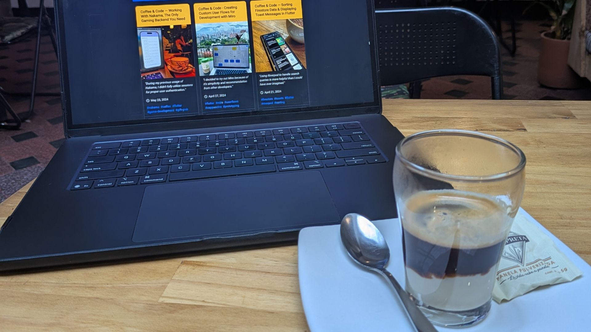
Coffee Break: Vietnamese Iced Coffee
If you're in the area, don't sleep on the Vietnamese Iced Coffee from Klerje Coffee. I've yet to have one I don't like, and this one delivered—bold, smooth, and that perfect sweet-bitter balance. $6 got me a substantial glass, so I'll definitely be back.
8/10